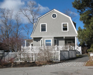
 We recently completed the installation of about 16 fixtures into a C. 1901 Dutch Colonial home. The owners had been on our email list for about 10 years and had started receiving our Newsletters around the time they had purchased and done the initial renovation/restoration of the home. It was obvious that this was still an ongoing situation and they had come to realize an approach to completing the lighting.
There were 4 original Art Nouveau windows on two levels in a very large and beautiful period Stairwell. Their idea was to use the colors ( amber, green, pink) and the detail of the windows to introduce period fixtures in different areas of the house. We entered into a quite pleasurable collaboration where the use of slag glass fixtures of the Art Nouveau and Arts and Crafts design movements ended up working very well.
They had been thinking about this approach for a while and a visit to the Ponzi Mansion in Lexington, MA impressed them that the use of period light fixtures could add quite a bit to their already quite beautiful house.
They had collaborated with an Architect friend to recontextualize rooms off the original Kitchen in the back of the house and create an large open area with views of the outside. This made way for the use of a Japanese Revival Arts and Crafts fixture over the Kitchen table and the use of 3 Amber Slag glass Pendants over the Kitchen Island. The Kitchen was mostly white and the use of parallel lines in the original designs made the application of these fixtures very interesting.
In the collaboration we often felt that we were providing a palette to be used and having quite a bit of inventory allowed lighting placement to work in the different areas. There were times when our expertise about different aspects of the period fixtures was needed but most of the time it was a question of how much detail needed to be added to the already original period attributes of the house. In addition the owners had kept quite true to any additions they had made in the upgrades and often the use of the concept ” less is more” became a guide phrase to the incorporation of the light fixtures.
Beaded details in the Dining room brought in a somewhat simple Arts and Crafts five Light for over the table. A Green Inverted Dome with a little of the pink in the windows ended up working very well on the Bottom level of the Stairwell. A somewhat minimal Art Nouveau Inverted Dome highlights the Amber colors in the widows on the top level.
We continued the movement through the smaller areas with Sconces of the period in the upstairs Foyer, through hall to the Powder room and back Stairwell. We added a Vestibule light with Amber Slag Glass that ended up working very well with the owners choice of Wallpaper.
Introduction to the photos: In providing photos of our clients houses we are less interested in providing a professional ” Photo Shoot” but are maintaining a quick sketch of what we did so as to not interfere with the owners living situation.